

Some brands start from nothing. Baker Street Properties started from almost nothing — a single logo mark, floating on its own. They liked it, it worked, but everyone on the team could feel what was missing: no colors, no system, no visual language holding anything together. A mark without a brand around it. Nothing recognizable, and nothing that said who they actually were.
And who they are is the interesting part. Baker Street is a property management company, but not the kind you're picturing. They're a team of genuinely good humans who happen to leverage technology brilliantly — using it to make life easier for the owners and tenants they serve, without ever letting the tech get in the way of the people. That tension became the brief: how do you build a brand that feels modern and forward-thinking, but also warm, human, and approachable? Most property management brands pick a lane. Either they're all software and efficiency — cold, corporate, faceless — or they're all handshakes and stock photos of smiling agents. Baker Street needed to hold both.
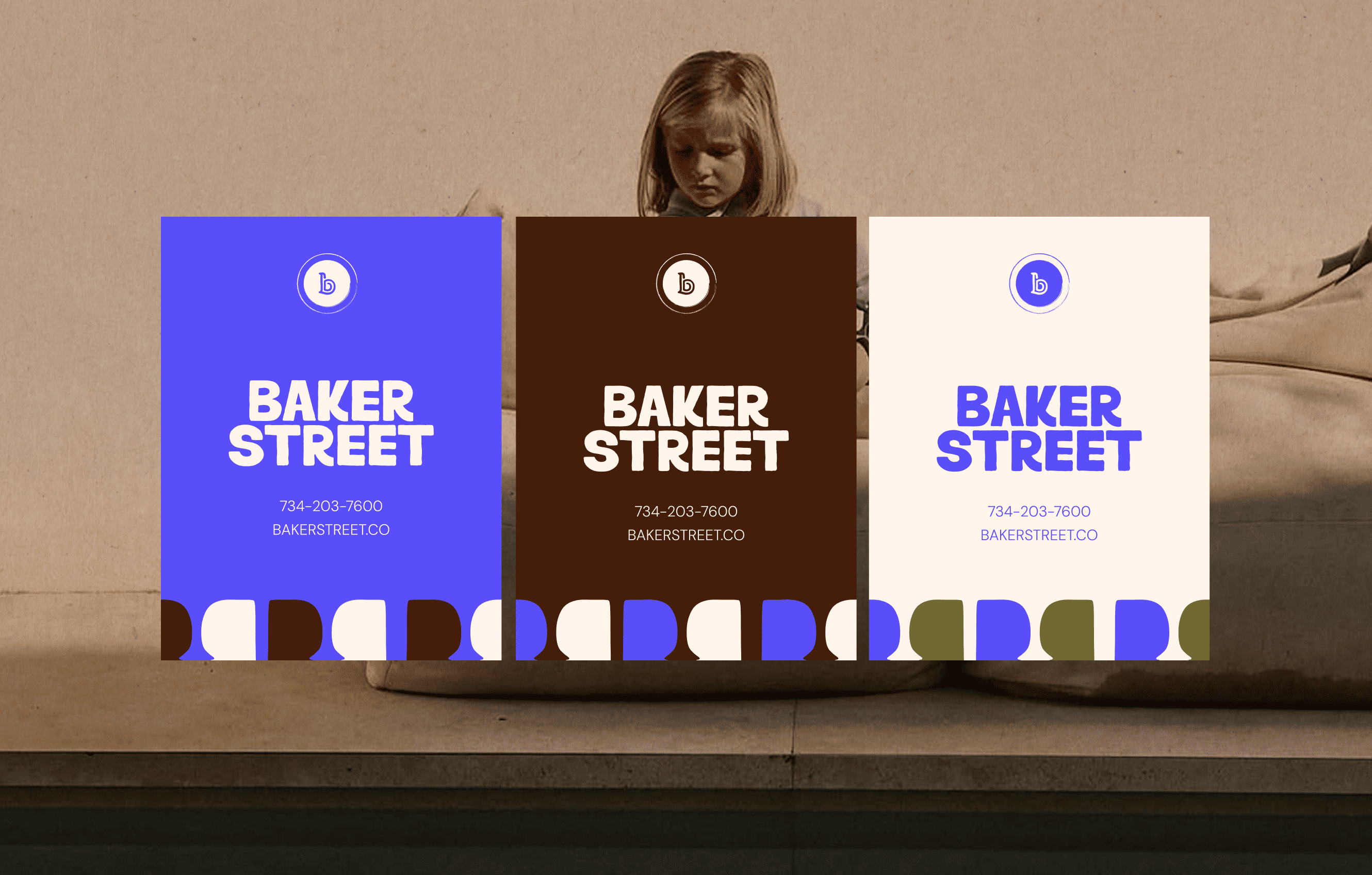
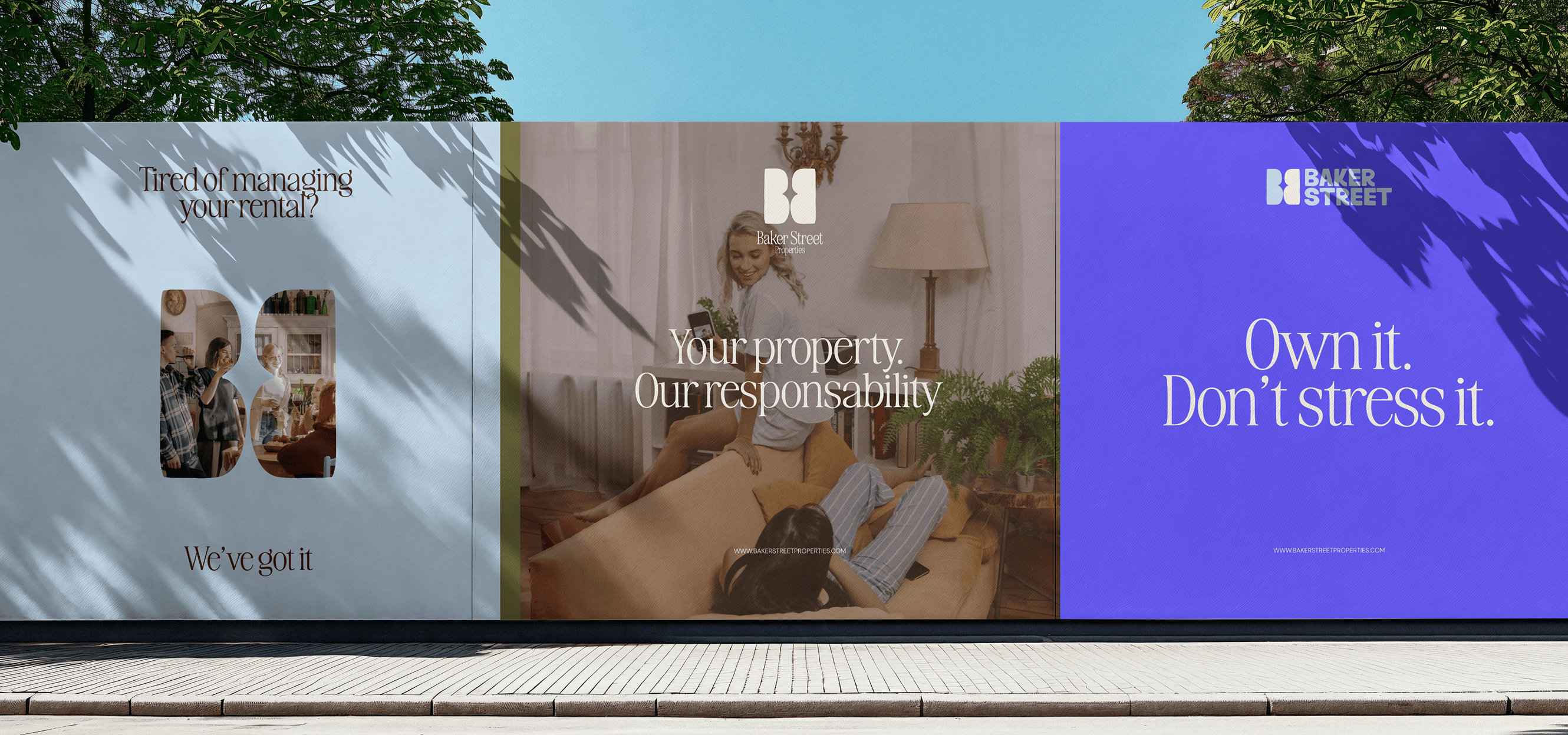
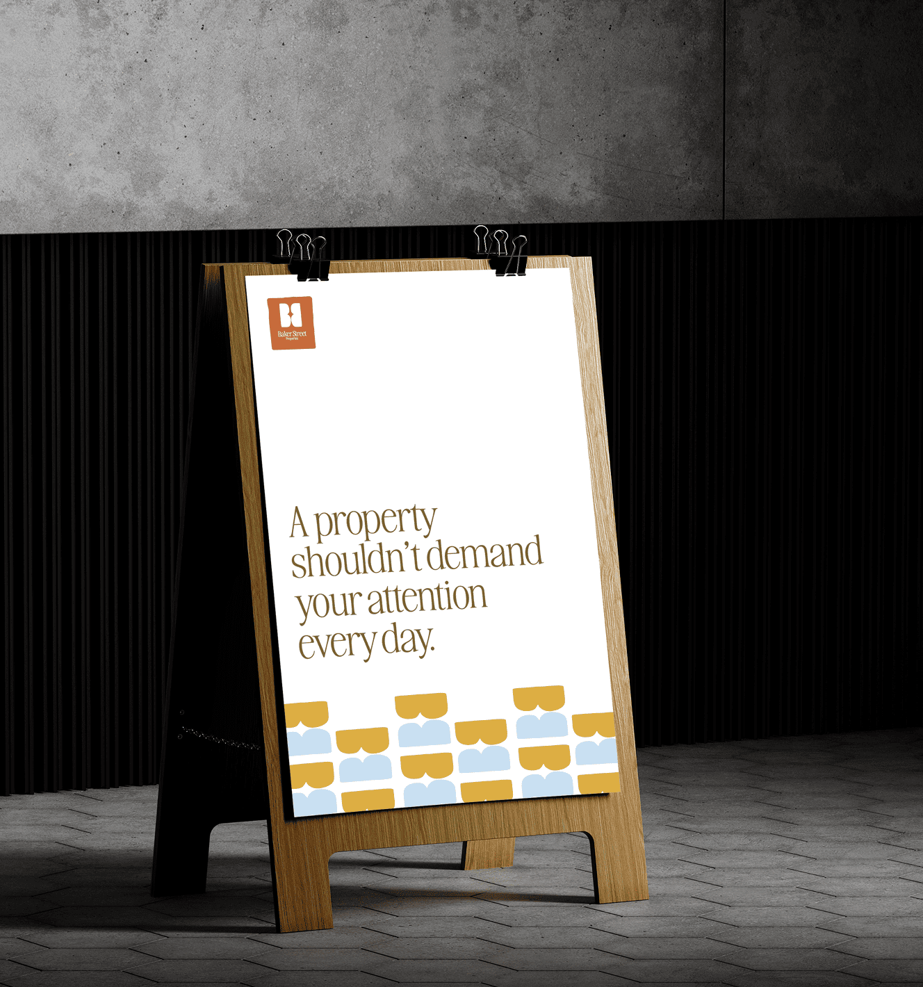
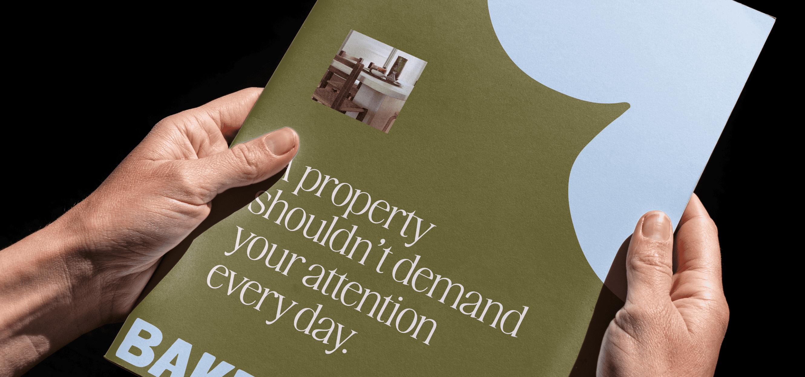
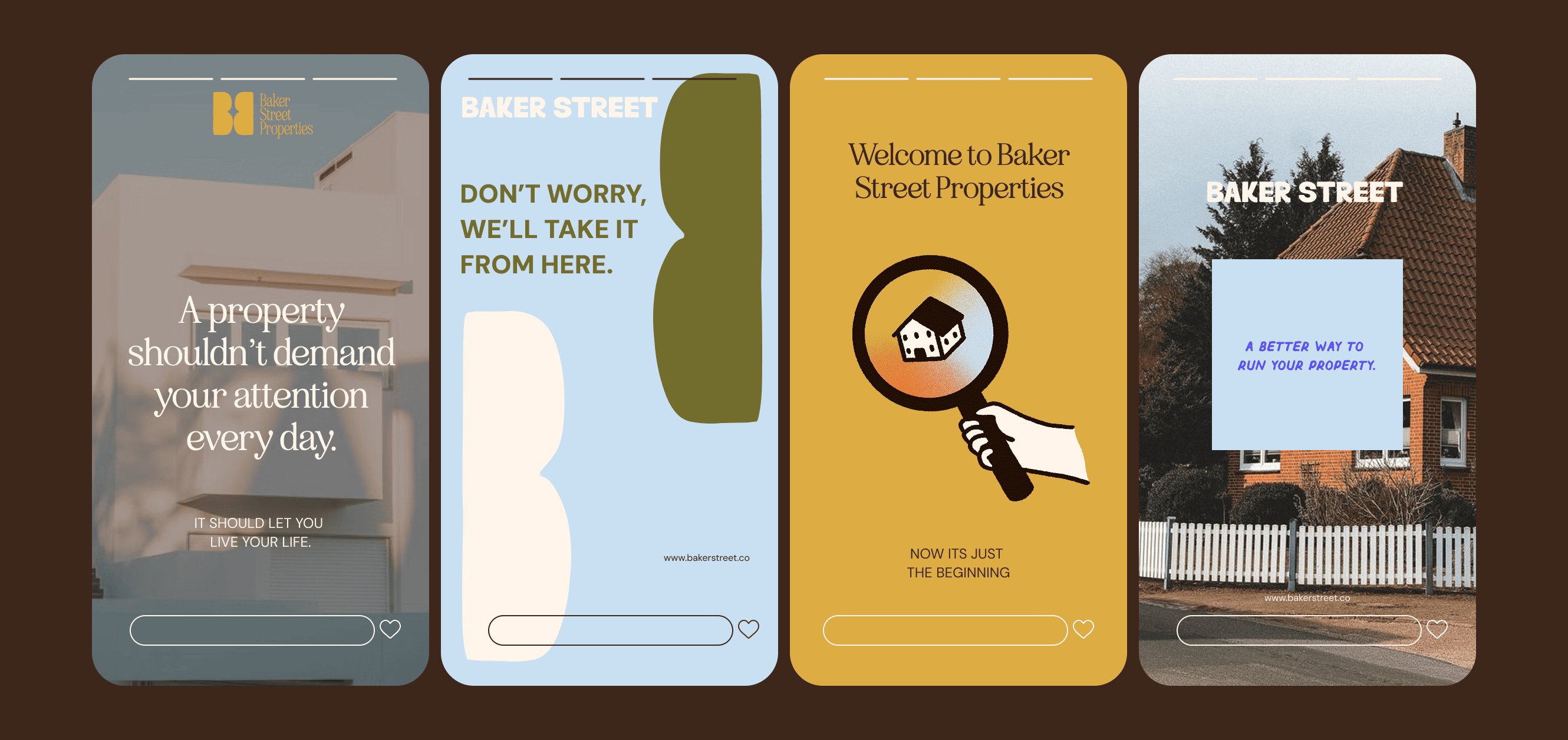
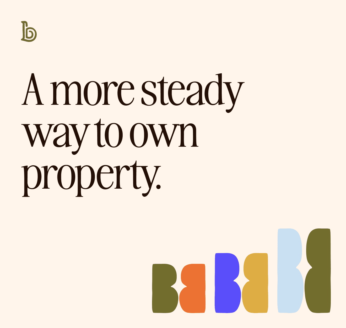
So that's what we built. Rather than starting from zero, we kept the original logo mark as the anchor of the system — a nod to where the company came from — and expanded everything around it. A full brand identity with a palette, typography, and graphic language designed to be vibrant, versatile, and genuinely fun to use, without losing the credibility a company managing people's homes and investments needs.
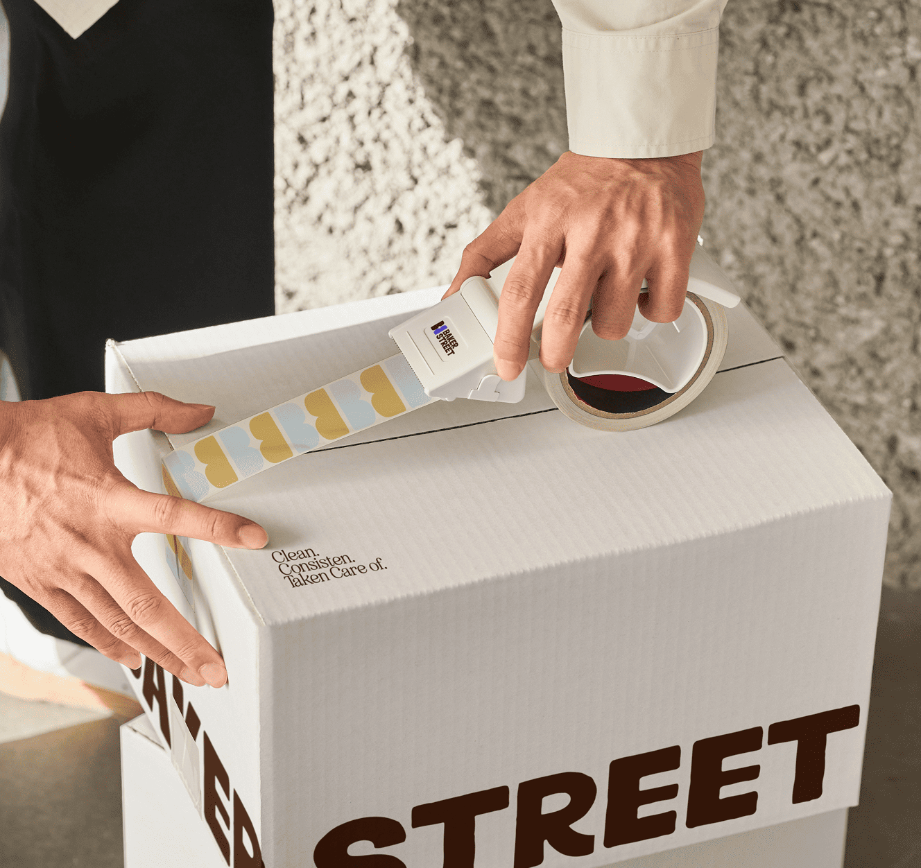
Versatility was more than an aesthetic choice — it was a practical one. The Baker Street team applies their brand themselves, every day, across owner communications, tenant touchpoints, and internal materials. The system had to be something non-designers could pick up and use with confidence, and still look intentional every time. Clear rules, flexible components, no guesswork.
The result is a brand that finally matches the company behind it: tech-forward but never sterile, professional but never stiff. Recognizable, ownable, and built to be used — by a team that's proud to put it on everything they touch.
Brand Illustrations by Rocio Diestra










'%3e%3cg id='Final-Copy-2_2_' transform='translate(1275.000000, 200.000000)'%3e%3cpath class='st0' d='M7.4,12.8h6.8l3.1-11.6H7.4C4.2,1.2,1.6,3.8,1.6,7S4.2,12.8,7.4,12.8z'/%3e%3c/g%3e%3c/g%3e%3c/g%3e%3cg id='final---dec.11-2020'%3e%3cg id='_x30_208-our-toggle' transform='translate(-1275.000000, -200.000000)'%3e%3cg id='Final-Copy-2' transform='translate(1275.000000, 200.000000)'%3e%3cpath class='st1' d='M22.6,0H7.4c-3.9,0-7,3.1-7,7s3.1,7,7,7h15.2c3.9,0,7-3.1,7-7S26.4,0,22.6,0z M1.6,7c0-3.2,2.6-5.8,5.8-5.8 h9.9l-3.1,11.6H7.4C4.2,12.8,1.6,10.2,1.6,7z'/%3e%3cpath id='x' class='st2' d='M24.6,4c0.2,0.2,0.6,0.8l0,0L22.5,7l2.2,2.2c0.2,0.2,0.2,0.6,0,0.8c-0.2,0.2-0.6,0.2-0.8,0 l0,0l-2.2-2.2L19.5,10c-0.2,0.2-0.6,0.2-0.8,0c-0.2-0.2-0.2-0.6,0-0.8l0,0L20.8,7l-2.2-2.2c-0.2-0.2-0.2-0.6,0-0.8 c0.2-0.2,0.6-0.2,0.8,0l0,0l2.2,2.2L23.8,4C24,3.8,24.4,3.8,24.6,4z'/%3e%3cpath id='y' class='st3' d='M12.7,4.1c0.2,0.2,0.3,0.6,0.1,0.8l0,0L8.6,9.8C8.5,9.9,8.4,10,8.3,10c-0.2,0.1-0.5,0.1-0.7-0.1l0,0 L5.4,7.7c-0.2-0.2-0.2-0.6,0-0.8c0.2-0.2,0.6-0.2,0.8,0l0,0L8,8.6l3.8-4.5C12,3.9,12.4,3.9,12.7,4.1z'/%3e%3c/g%3e%3c/g%3e%3c/g%3e%3c/g%3e%3c/svg%3e)